Reeded Bathroom Vanity
You may have noticed a new cabinet profile that's been trending, but is it a timeless choice for your kitchen? Here's what I think about the reeded cabinet trend.
Reeded Cabinets: Trendy or Timeless?
This week on Instagram, I posted this image (below) of a bathroom with reeded wood cabinets, which has been trending for a few years now.
I asked my followers what they thought and here were some of the comments:
"I think it will date quickly."
"Wouldn't this be tedious to clean?"
"Yay, I will take any cabinet style other than shaker!"
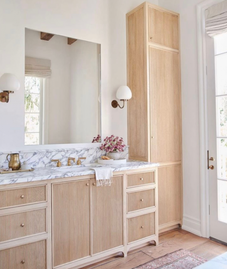
Amber Interiors
Here was a good one I responded to:
"I am confused on this one. Wouldn't reed cabinetry date just like paint colours? Do you really recommend it for cabinetry? I would assume this should be used in a moveable piece of furniture, not something fixed. Am I misunderstanding?"
My response was similar to this (but now I'm adding to it):
There's nothing wrong with a current cabinet door design. Everything but a home designed entirely in the French look, looks dated eventually. The real question is, "How long will it take to look truly dated?"
This is what will date your interior
Overdoing the trendy neutral colour of the moment will date your interior the fastest. For example, if in the brown trend, you filled up your home with dark espresso furniture, it's technically dated. But a colourful interior–even with the same espresso case goods–will always last longer than a room filled with ALL brown-on-brown or grey-on-grey furniture.
What will technically make a white kitchen feel dated is that kitchen designs are constantly improving.
For example, what makes a timeless white kitchen from 10 years ago look dated from today is that now we're designing kitchens with no uppers. Never mind upper shelving, the new trend in kitchens which looks truly luxurious, spacious and even better, feels less like a utilitarian kitchen and more like another room in your home.
Read more: How soon will my farmhouse kitchen look dated?
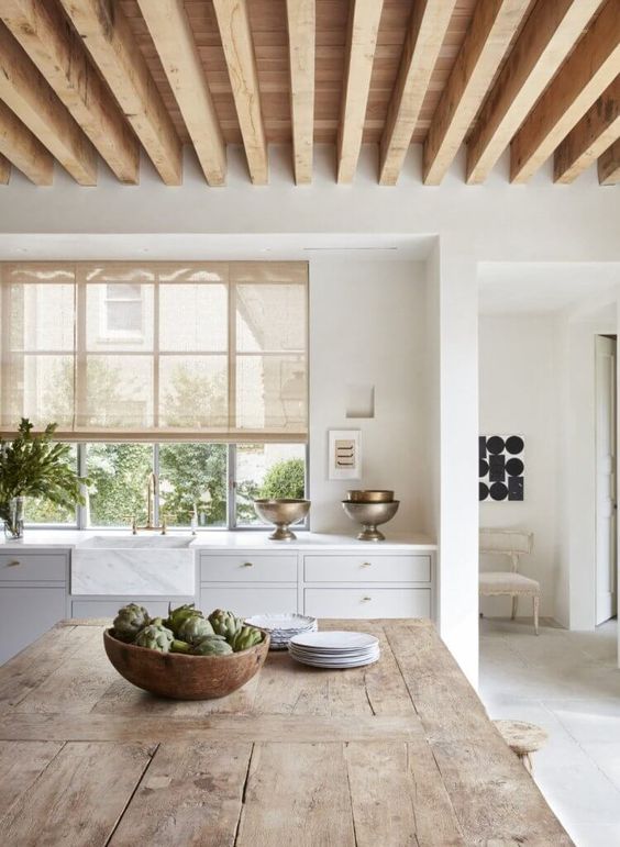
Jill Egan
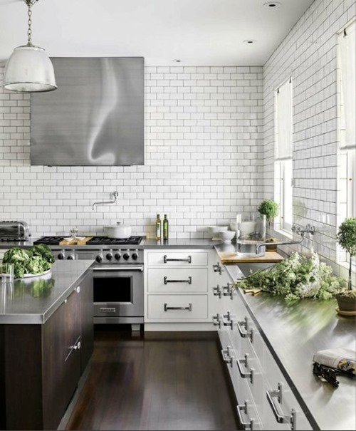
Apartment Therapy
And here's one (below) that looks very 2021 because of all the trendy black windows, black lighting AND black countertops:
Read more: Are Black Windows the Best Choice for Your New Build?
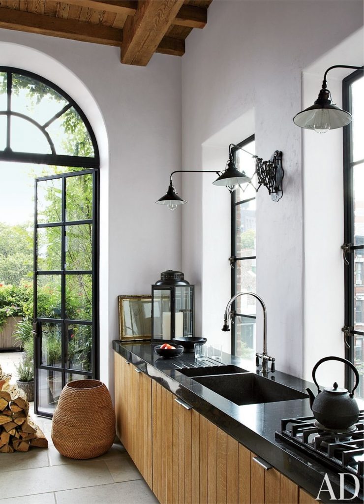
AD
Regardless of that, it's in Architectural Digest because many of us would happily take this kitchen if we could have that light and the inviting garden retreat just beyond those amazing doors.
Just in time for this blog post, I received this question today:
"While we still have crown mouldings to install, light fixtures and stools to replace, my question is in regards to the backsplash. Learning from your blog, I know I'm definitely going with white subway tile but I have a question about installing the tile around the windows.
If we only had the one window at the kitchen sink, I would install the subway tile to the ceiling, however since we have the 2 windows, how do you handle that since I don't think the other window would look right with the tile all the way up? Would I leave the height at both windows to the level of the bottom of the upper cabinets? Could I put tile up to the ceiling around the sink window but not the second window?"
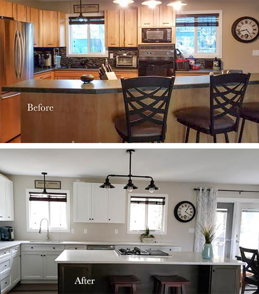
While the new kitchen design is 100% better, I would remove the cabinets between the two windows (if you can manage without that storage) and then install the subway tile all the way to the ceiling. As you have already concluded, there is no natural ending point otherwise. Hang some art there instead and it will feel so much more spacious!
I would also continue the cabinets to the ceiling with moulding. It's one of my favorite designer tricks for updating older cabinets.
Just like in this kitchen below:
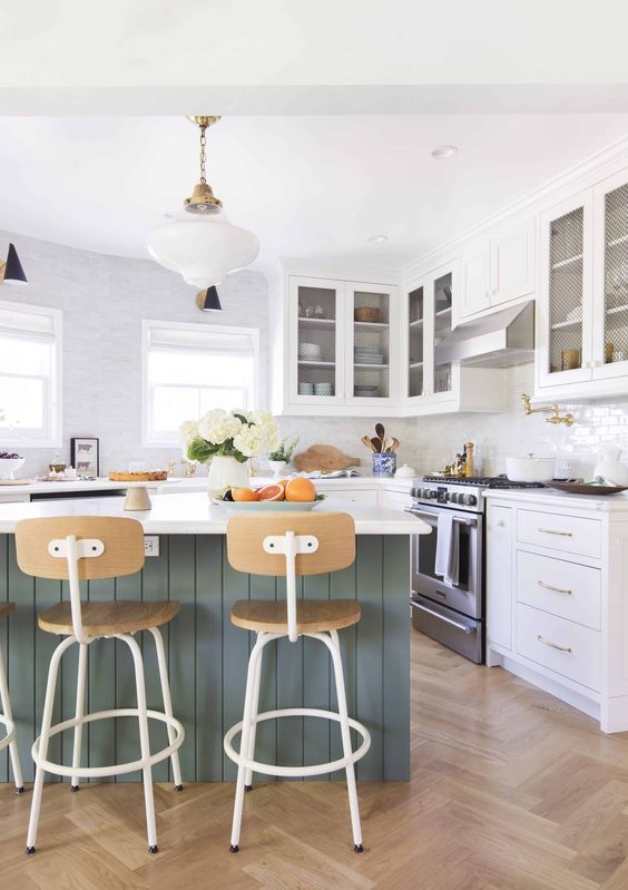
Emily Henderson
But back to trending cabinet profiles. Shaker cabinets are about as standard as they get (but that's because it's one of the least expensive profiles) and have we seen an awful lot of them this past decade?
Yes.
And is it refreshing to see something "new"? Absolutely.
The thing is, there is no guaranteed-timeless anything you can install if you don't pay attention to the details of your design.
Even the most classic black and white hex floor can look off in the wrong application (gasp!). Or white subway tile, if it is awkwardly meandering around badly placed cabinets.
Beauty is in the details.
And by details, I don't mean flourishes and embellishments as in the overwrought, kitschy version of the "French Country" kitchen that can commonly be found in too-large homes created with too-little design sense. What I'm talking about is good, functional layout, attention to levels and scale, and balance of colour and materials.
It's when we see a trend done badly over and over that we start to turn away from it.
Let's go back to the another charming bathroom with reeded cabinetry.
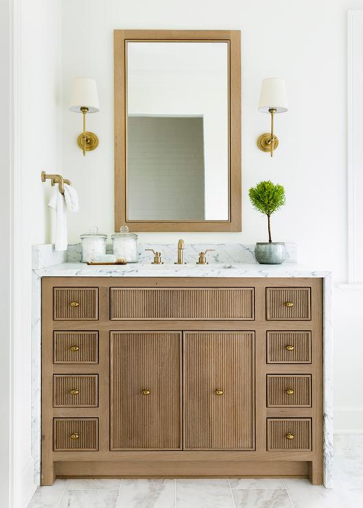
Bria Hammel Interiors
If in 10 years, we've all been completely overexposed to this cabinet style (and I'm not convinced it will take the masses by storm, given it will definitely cost more) – the timeless white marble countertop and floor, perfectly installed sconces, pretty coordinating mirror, will still give this room longevity.
In this bathroom the reeded texture adds interest and character. It looks custom and beautiful.
Invest in the details and you will create something beautiful that you won't come to dislike in time. Ignore them, and your kitchen (or bathroom) will look tired very quickly, regardless of how timeless or trendy it is.
If you'd like help creating your classic kitchen or bathroom, see my virtual packages here.
Related posts:
Magazine Worthy Kitchen Designs Cannot be Easily Copied
Top Kitchen Colour Trends from the last 50 Years
Classic and Timeless Design Tips for a Home You'll Love Forever
Source: https://mariakillam.com/trend-reeded-cabinets/


Tidak ada komentar:
Posting Komentar